1. Why Statistics Matter for Synthetic Data
Synthetic data is not magic. It is, at its core, a mathematical statement about patterns found in real data. To generate synthetic data effectively, you must first understand what you are modeling—the distributions, correlations, and edge cases present in your source dataset. Without this understanding, you risk creating data that looks reasonable on the surface but fails to capture the underlying reality, leading to poor model performance when synthetic data is used for training or testing.
Statistics provides the framework for this understanding. It answers fundamental questions:
- What is the typical value of a feature? (central tendency)
- How spread out are the values? (dispersion)
- Are features independent or correlated? (joint distributions)
- What are the tail behaviors and extreme cases? (distributional shape)
- How confident are we in our estimates? (uncertainty quantification)
The approach taken in this chapter is deliberately model-first: we start with the assumption that real-world data follows (or approximates) known statistical distributions, and we use techniques to estimate those distributions from observed data. This is the foundation for rule-based and simulation-based synthetic data generation methods covered in Chapter 3. Later chapters will introduce more sophisticated, data-driven approaches like deep learning that can learn complex distributions implicitly.
2. Probability Distributions
A probability distribution describes how likely different outcomes are. In the context of synthetic data, knowing the shape and parameters of the distributions of your features allows you to sample new synthetic values that preserve the statistical properties of the original data.
2.1 Common Univariate Distributions
Normal (Gaussian) Distribution: The most famous distribution, characterized by a bell curve. Defined by mean μ and standard deviation σ. Many real-world phenomena (e.g., human height, measurement errors) approximate normality. Probability density function: f(x) = (1/(σ√(2π))) * exp(-(x-μ)²/(2σ²)).
Poisson Distribution: Used for count data (number of events in a fixed interval). Defined by a single parameter λ (rate). Useful for modeling discrete events like customer arrivals or error counts.
Exponential Distribution: Models the time between events in a Poisson process. Common in reliability engineering and queue theory. Has a characteristic "memoryless" property.
Categorical Distribution: Discrete distribution over a finite set of categories. Each category has a probability. Used for modeling features like color, region, or customer segment.
Beta Distribution: Flexible distribution on [0,1], useful for proportions and percentages. Controlled by two shape parameters (α, β).
2.2 Sampling from Distributions in Python
Here is a practical example using NumPy and SciPy to sample from various distributions:
import numpy as np
from scipy import stats
import matplotlib.pyplot as plt

# Set seed for reproducibility
np.random.seed(42)

# Normal distribution
normal_samples = np.random.normal(loc=100, scale=15, size=10000)

# Poisson distribution (count data, e.g., customer visits per day)
poisson_samples = np.random.poisson(lam=5, size=10000)

# Exponential distribution (e.g., time until next event)
exponential_samples = np.random.exponential(scale=2.0, size=10000)

# Categorical distribution (e.g., product category)
categories = ['Electronics', 'Clothing', 'Food', 'Books']
probabilities = [0.3, 0.35, 0.25, 0.1]
categorical_samples = np.random.choice(categories, size=10000, p=probabilities)

# Beta distribution (e.g., user satisfaction on [0,1])
beta_samples = np.random.beta(a=2, b=5, size=10000)

# Visualize
fig, axes = plt.subplots(2, 2, figsize=(12, 8))

axes[0, 0].hist(normal_samples, bins=50, density=True, alpha=0.7, edgecolor='black')
axes[0, 0].set_title('Normal Distribution (μ=100, σ=15)')
axes[0, 0].set_xlabel('Value')
axes[0, 0].set_ylabel('Density')

axes[0, 1].hist(poisson_samples, bins=range(0, max(poisson_samples)+2), density=True, alpha=0.7, edgecolor='black')
axes[0, 1].set_title('Poisson Distribution (λ=5)')
axes[0, 1].set_xlabel('Count')
axes[0, 1].set_ylabel('Probability')

axes[1, 0].hist(exponential_samples, bins=50, density=True, alpha=0.7, edgecolor='black')
axes[1, 0].set_title('Exponential Distribution (scale=2)')
axes[1, 0].set_xlabel('Time')
axes[1, 0].set_ylabel('Density')

unique, counts = np.unique(categorical_samples, return_counts=True)
axes[1, 1].bar(unique, counts/len(categorical_samples), alpha=0.7, edgecolor='black')
axes[1, 1].set_title('Categorical Distribution')
axes[1, 1].set_xlabel('Category')
axes[1, 1].set_ylabel('Probability')

plt.tight_layout()
plt.savefig('distributions.png', dpi=150, bbox_inches='tight')
plt.show()

print(f"Normal: mean={normal_samples.mean():.2f}, std={normal_samples.std():.2f}")
print(f"Poisson: mean={poisson_samples.mean():.2f}")
print(f"Exponential: mean={exponential_samples.mean():.2f}")
print(f"Beta: mean={beta_samples.mean():.2f}, min={beta_samples.min():.2f}, max={beta_samples.max():.2f}")
print(f"\nCategorical counts:\n{dict(zip(unique, counts))}")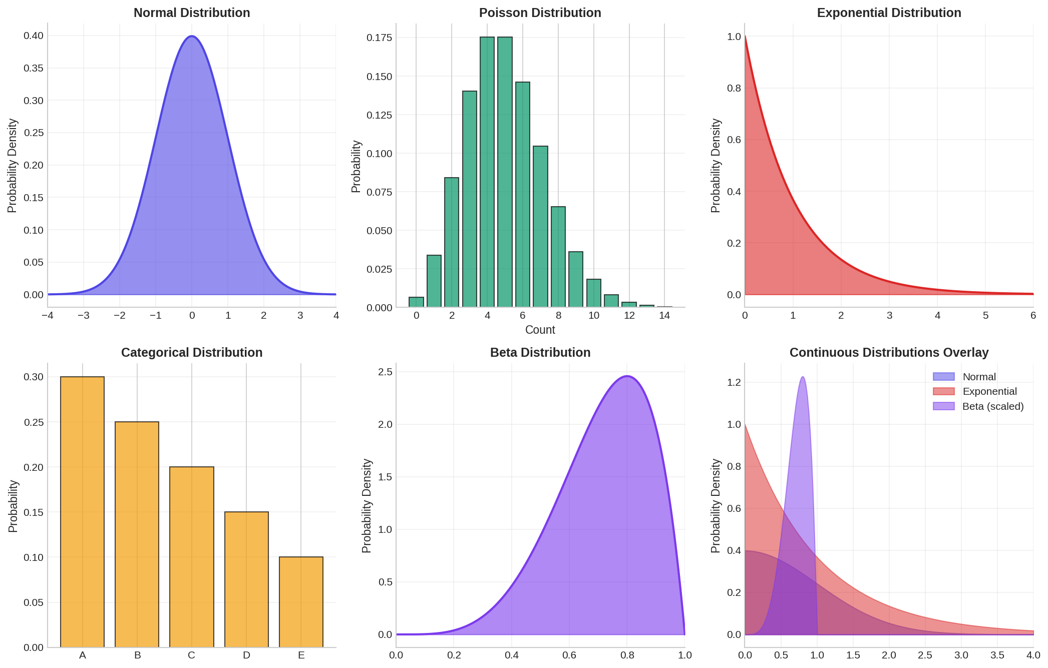
3. Joint Distributions & Correlations
Real-world datasets rarely consist of independent features. Customer age correlates with purchase frequency; income correlates with spending; product quality correlates with return rate. Ignoring these correlations when generating synthetic data produces unrealistic records that fail to preserve the multivariate structure of the original dataset.
A joint distribution describes the probability of multiple variables occurring together. The marginal distribution of a single variable is obtained by "integrating out" all other variables. The key challenge in synthetic data generation is to preserve both marginal distributions (individual feature distributions) and joint relationships (correlations and dependencies).
3.1 Correlation and Covariance
Covariance measures how two variables move together. If one tends to increase when the other increases, covariance is positive. The covariance matrix Σ for multiple variables encodes all pairwise relationships.
Pearson correlation r normalizes covariance to [-1, 1], where r=1 means perfect positive correlation, r=-1 means perfect negative correlation, and r=0 means no linear relationship.
However, correlation only captures linear relationships. Rank correlations (Spearman, Kendall) are more robust to outliers and nonlinear monotonic relationships.
3.2 Multivariate Normal Distribution
The multivariate normal (MVN) distribution generalizes the univariate normal to multiple dimensions. It is fully characterized by a mean vector μ and covariance matrix Σ. A key property: any subset of MVN variables is also MVN.
Here is an example of sampling from a multivariate normal distribution and examining correlations:
import numpy as np
from scipy import stats
import pandas as pd
import matplotlib.pyplot as plt

# Define parameters for a 3-dimensional normal distribution
mean = np.array([50, 100, 0.5])  # age, income (thousands), fraction

# Define correlation structure
correlation_matrix = np.array([
    [1.0,   0.6,  -0.3],   # age correlated with income
    [0.6,   1.0,  -0.2],   # income slightly negatively correlated
    [-0.3, -0.2,   1.0]    # with fraction
])

# Convert correlation matrix to covariance matrix
# Cov(X,Y) = Corr(X,Y) * σ_X * σ_Y
stds = np.array([15, 30, 0.15])  # standard deviations
cov_matrix = np.outer(stds, stds) * correlation_matrix

# Sample from the distribution
n_samples = 5000
mvn = stats.multivariate_normal(mean=mean, cov=cov_matrix)
samples = mvn.rvs(size=n_samples, random_state=42)

# Convert to DataFrame for easier inspection
df = pd.DataFrame(samples, columns=['Age', 'Income_k', 'Fraction'])

# Compute realized correlations
print("Correlation Matrix (Realized):")
print(df.corr())
print("\nDescriptive Statistics:")
print(df.describe())

# Visualize pairwise relationships
fig, axes = plt.subplots(1, 3, figsize=(14, 4))

axes[0].scatter(df['Age'], df['Income_k'], alpha=0.3, s=10)
axes[0].set_xlabel('Age')
axes[0].set_ylabel('Income (thousands)')
axes[0].set_title(f"Age vs Income (r={df['Age'].corr(df['Income_k']):.2f})")

axes[1].scatter(df['Age'], df['Fraction'], alpha=0.3, s=10)
axes[1].set_xlabel('Age')
axes[1].set_ylabel('Fraction')
axes[1].set_title(f"Age vs Fraction (r={df['Age'].corr(df['Fraction']):.2f})")

axes[2].scatter(df['Income_k'], df['Fraction'], alpha=0.3, s=10)
axes[2].set_xlabel('Income (thousands)')
axes[2].set_ylabel('Fraction')
axes[2].set_title(f"Income vs Fraction (r={df['Income_k'].corr(df['Fraction']):.2f})")

plt.tight_layout()
plt.savefig('multivariate_normal.png', dpi=150, bbox_inches='tight')
plt.show()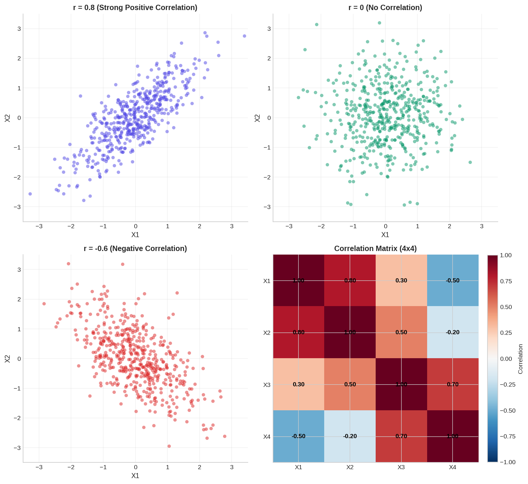
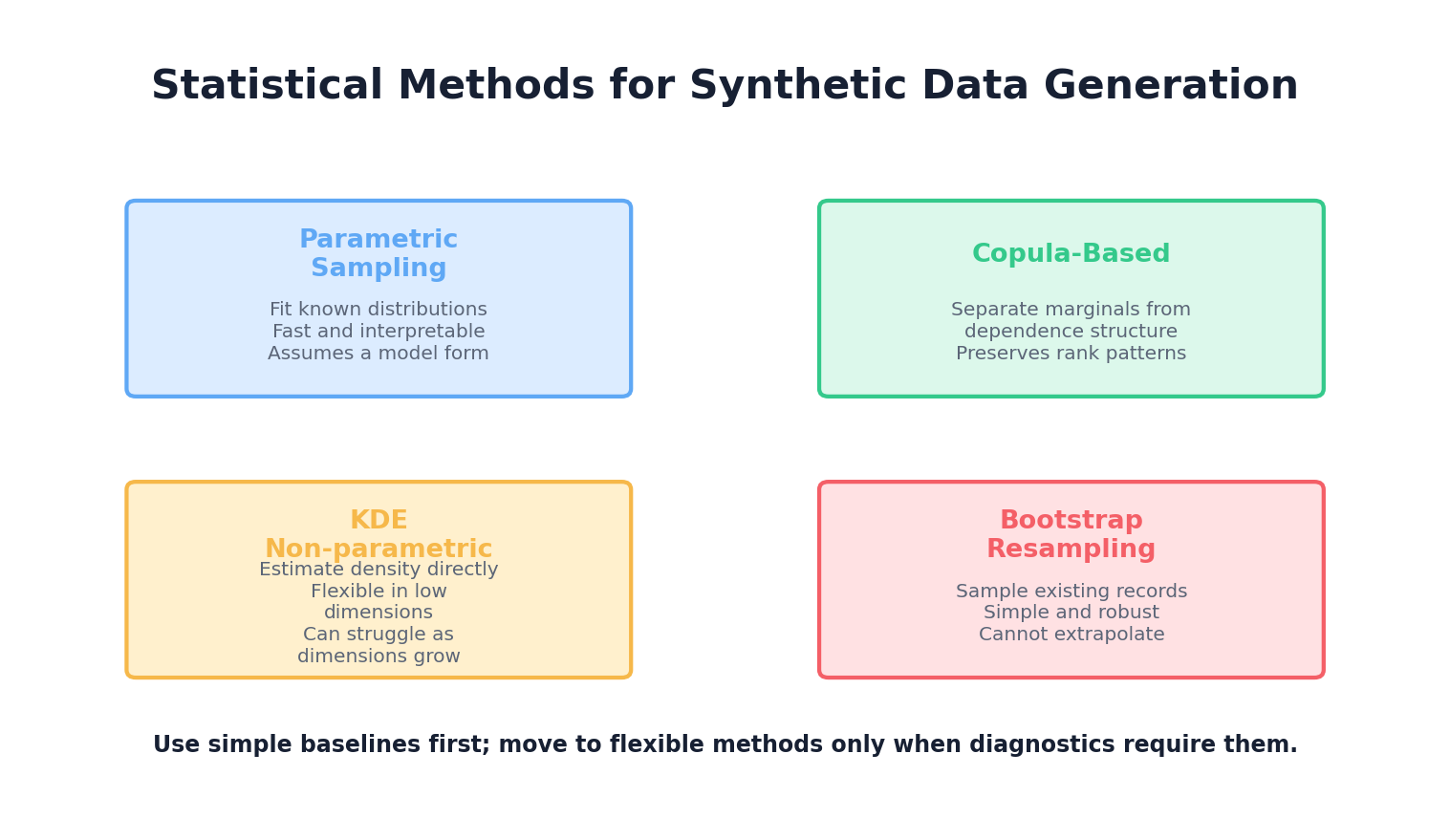
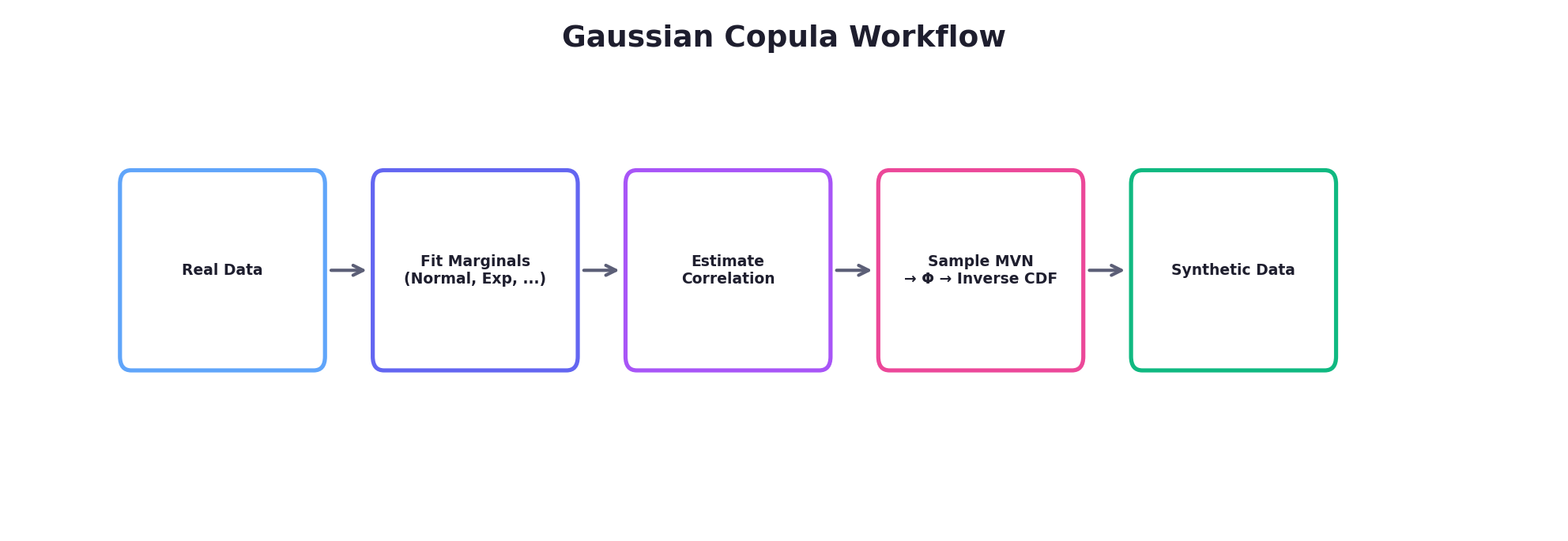
4. Copulas: Decoupling Marginals from Dependence
A copula is a mathematical function that couples (hence the name) the marginal distributions of multiple variables while allowing you to specify the dependence structure independently. This is powerful: you can take a normal distribution, an exponential distribution, and a categorical distribution—three different marginals—and link them with any dependence structure you choose.
Formally, a copula C is a multivariate cumulative distribution function (CDF) on [0,1]^d such that the marginal distributions are uniform on [0,1]. By Sklar's theorem, any multivariate distribution can be decomposed as:
F(x₁, x₂, ..., xₐ) = C(F₁(x₁), F₂(x₂), ..., Fₐ(xₐ))
where F is the joint CDF, Fᵢ are the marginal CDFs, and C is the copula. The power of this decomposition is that you can:
- Estimate or specify each marginal Fᵢ independently
- Estimate or specify the copula C independently
- Combine them to generate synthetic samples
4.1 Gaussian Copula
The Gaussian copula is the most commonly used copula in practice. It derives a dependence structure from a multivariate normal distribution. The procedure:
- Sample from a multivariate normal distribution with a specified correlation matrix
- Transform each component to uniform [0,1] using the normal CDF (Φ)
- Transform each uniform value to the desired marginal using the inverse CDF (quantile function)
4.2 Gaussian Copula Example in Python
Here we generate synthetic data with a normal marginal, an exponential marginal, and a discrete marginal, while preserving a specified correlation structure:
import numpy as np
from scipy import stats
import pandas as pd

def gaussian_copula_sample(marginal_rvs, correlation_matrix, n_samples, random_state=None):
    """
    Generate samples using Gaussian copula.

    Parameters:
    -----------
    marginal_rvs : list of scipy.stats rv_frozen objects
        Frozen scipy distributions for each marginal (e.g., norm(), expon(), etc.)
    correlation_matrix : ndarray
        Correlation matrix for the Gaussian copula
    n_samples : int
        Number of samples to generate
    random_state : int
        Seed for reproducibility

    Returns:
    --------
    ndarray of shape (n_samples, len(marginal_rvs))
    """
    rng = np.random.default_rng(random_state)
    d = len(marginal_rvs)

    # Step 1: Sample from multivariate normal (local RNG — no global seed mutation)
    mvn = stats.multivariate_normal(
        mean=np.zeros(d), cov=correlation_matrix, seed=rng
    )
    normal_samples = mvn.rvs(size=n_samples)

    # Step 2: Transform to uniform [0,1] using normal CDF
    uniform_samples = stats.norm.cdf(normal_samples)

    # Step 3: Transform to target marginals using inverse CDF (ppf = percent point function)
    synthetic = np.zeros((n_samples, d))
    for i, marginal in enumerate(marginal_rvs):
        synthetic[:, i] = marginal.ppf(uniform_samples[:, i])

    return synthetic

# Define target marginals
marginal_1 = stats.norm(loc=50, scale=15)           # Normal: Age
marginal_2 = stats.expon(loc=20, scale=30)          # Exponential: Time since customer
marginal_3 = stats.binom(n=1, p=0.4)                # Binomial: Churned or not

marginals = [marginal_1, marginal_2, marginal_3]

# Define correlation structure (for the Gaussian copula latent space)
correlation_matrix = np.array([
    [1.0,   0.5,  -0.3],
    [0.5,   1.0,  -0.4],
    [-0.3, -0.4,   1.0]
])

# Generate synthetic samples
n_synthetic = 5000
synthetic_data = gaussian_copula_sample(
    marginals,
    correlation_matrix,
    n_synthetic,
    random_state=42
)

# Package as DataFrame
df_synthetic = pd.DataFrame(
    synthetic_data,
    columns=['Age', 'Days_Since_Signup', 'Churned']
)
df_synthetic['Churned'] = df_synthetic['Churned'].astype(int)

print("Synthetic Data Summary:")
print(df_synthetic.describe())
print("\nRealized Correlation Matrix:")
print(df_synthetic.corr())

# Visualization
import matplotlib.pyplot as plt

fig, axes = plt.subplots(1, 3, figsize=(14, 4))

axes[0].hist(df_synthetic['Age'], bins=30, alpha=0.7, edgecolor='black')
axes[0].set_title('Age Distribution')
axes[0].set_xlabel('Age')

axes[1].hist(df_synthetic['Days_Since_Signup'], bins=30, alpha=0.7, edgecolor='black')
axes[1].set_title('Days Since Signup (Exponential)')
axes[1].set_xlabel('Days')

df_synthetic.groupby('Churned').size().plot(kind='bar', ax=axes[2], alpha=0.7, edgecolor='black')
axes[2].set_title('Churn Distribution')
axes[2].set_xlabel('Churned')
axes[2].set_ylabel('Count')

plt.tight_layout()
plt.savefig('gaussian_copula.png', dpi=150, bbox_inches='tight')
plt.show()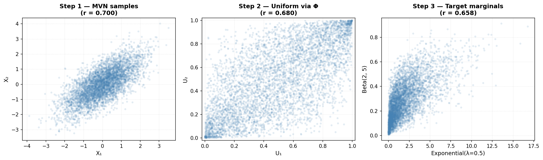
5. Kernel Density Estimation (KDE)
Parametric methods (like fitting a normal distribution) assume a specific functional form. Non-parametric methods make fewer assumptions about the underlying distribution, learning the density directly from data.
Kernel Density Estimation (KDE) is a non-parametric approach that represents each data point as a "bump" (kernel) and sums them to estimate the overall density. The density estimate at point x is:
f_KDE(x) = (1/n) * Σᵢ₌₁ⁿ K_h(x - xᵢ)
where K_h is a kernel function (often Gaussian) with bandwidth h, and n is the number of observations. The bandwidth h controls smoothness: small h creates a wiggly estimate, large h creates a smooth one.
5.1 KDE for Univariate Density Estimation
import numpy as np
from scipy import stats
from sklearn.neighbors import KernelDensity
import matplotlib.pyplot as plt

# Generate some realistic data with a bimodal pattern
# (e.g., two customer segments with different spending patterns)
np.random.seed(42)
segment_1 = np.random.normal(loc=30, scale=10, size=300)
segment_2 = np.random.normal(loc=80, scale=15, size=700)
real_data = np.concatenate([segment_1, segment_2])

# Fit KDE with different bandwidths
kde_narrow = KernelDensity(bandwidth=2, kernel='gaussian')
kde_moderate = KernelDensity(bandwidth=5, kernel='gaussian')
kde_wide = KernelDensity(bandwidth=10, kernel='gaussian')

kde_narrow.fit(real_data.reshape(-1, 1))
kde_moderate.fit(real_data.reshape(-1, 1))
kde_wide.fit(real_data.reshape(-1, 1))

# Generate points for evaluation
x_eval = np.linspace(real_data.min() - 10, real_data.max() + 10, 500)

# Evaluate densities
dens_narrow = np.exp(kde_narrow.score_samples(x_eval.reshape(-1, 1)))
dens_moderate = np.exp(kde_moderate.score_samples(x_eval.reshape(-1, 1)))
dens_wide = np.exp(kde_wide.score_samples(x_eval.reshape(-1, 1)))

# Plot
fig, axes = plt.subplots(1, 2, figsize=(14, 5))

# Left: Effect of bandwidth
axes[0].hist(real_data, bins=40, density=True, alpha=0.4, label='Histogram', edgecolor='black')
axes[0].plot(x_eval, dens_narrow, label='h=2 (narrow, overfits)', linewidth=2)
axes[0].plot(x_eval, dens_moderate, label='h=5 (moderate)', linewidth=2)
axes[0].plot(x_eval, dens_wide, label='h=10 (wide, oversmooths)', linewidth=2)
axes[0].set_xlabel('Spending ($)')
axes[0].set_ylabel('Density')
axes[0].set_title('Effect of Bandwidth on KDE')
axes[0].legend()

# Right: Sampling from KDE
samples_kde = kde_moderate.sample(n_samples=5000, random_state=42)
axes[1].hist(real_data, bins=40, density=True, alpha=0.4, label='Real Data', edgecolor='black')
axes[1].hist(samples_kde, bins=40, density=True, alpha=0.4, label='KDE Samples', edgecolor='black')
axes[1].set_xlabel('Spending ($)')
axes[1].set_ylabel('Density')
axes[1].set_title('Real Data vs. KDE-Sampled Synthetic Data')
axes[1].legend()

plt.tight_layout()
plt.savefig('kde_example.png', dpi=150, bbox_inches='tight')
plt.show()

print(f"Real data: mean={real_data.mean():.2f}, std={real_data.std():.2f}")
print(f"KDE samples: mean={samples_kde.mean():.2f}, std={samples_kde.std():.2f}")
print(f"KDE can be sampled directly, preserving the empirical distribution!")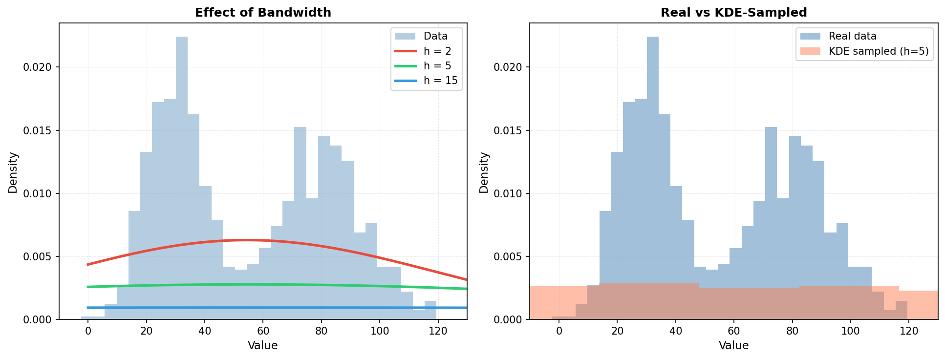
6. Maximum Likelihood Estimation (MLE)
Once you have chosen a parametric distribution (e.g., normal, exponential), you need to fit its parameters to your data. Maximum Likelihood Estimation is a principled statistical method that finds the parameters most likely to have generated the observed data.
Given data x₁, x₂, ..., xₙ and a distribution with parameters θ, the likelihood is:
L(θ) = Πᵢ₌₁ⁿ f(xᵢ | θ)
MLE finds θ* = argmax L(θ). In practice, we maximize the log-likelihood (to avoid numerical underflow) and often use optimization algorithms like gradient descent or Newton-Raphson.
6.1 MLE Example: Fitting a Normal Distribution
import numpy as np
from scipy import stats, optimize
import matplotlib.pyplot as plt

# Simulate real data from unknown distribution
np.random.seed(42)
real_data = np.random.normal(loc=100, scale=20, size=200)

# Manual MLE for Normal Distribution
def negative_log_likelihood(params, data):
    """Compute negative log-likelihood for normal distribution.

    log L(mu, sigma | data) = -n * log(sigma * sqrt(2*pi))
                              - sum((x - mu)^2) / (2 * sigma^2)
    We return -log L so scipy.optimize.minimize finds the MLE.
    """
    mu, sigma = params
    if sigma <= 0:
        return np.inf  # Invalid parameter
    n = len(data)
    nll = (0.5 * n * np.log(2 * np.pi)
           + n * np.log(sigma)
           + np.sum((data - mu) ** 2) / (2 * sigma ** 2))
    return nll

# Initial guess (method-of-moments)
mu_init = real_data.mean()
sigma_init = real_data.std()
initial_params = [mu_init, sigma_init]

# Optimize
result = optimize.minimize(
    negative_log_likelihood,
    initial_params,
    args=(real_data,),
    method='Nelder-Mead'
)

mu_mle, sigma_mle = result.x

print(f"True parameters: μ=100, σ=20")
print(f"MLE estimates: μ={mu_mle:.2f}, σ={sigma_mle:.2f}")
print(f"Sample statistics: mean={real_data.mean():.2f}, std={real_data.std():.2f}")

# Alternatively, use scipy.stats built-in fitting
mu_scipy, sigma_scipy = stats.norm.fit(real_data)
print(f"SciPy fit: μ={mu_scipy:.2f}, σ={sigma_scipy:.2f}")

# Generate synthetic data from fitted distribution
synthetic_normal = np.random.normal(loc=mu_mle, scale=sigma_mle, size=1000)

# Visualization
fig, axes = plt.subplots(1, 3, figsize=(14, 4))

# Left: Histogram with fitted curve
axes[0].hist(real_data, bins=20, density=True, alpha=0.6, label='Real Data', edgecolor='black')
x_range = np.linspace(real_data.min(), real_data.max(), 100)
axes[0].plot(x_range, stats.norm.pdf(x_range, mu_mle, sigma_mle), 'r-', linewidth=2, label='Fitted Normal')
axes[0].set_xlabel('Value')
axes[0].set_ylabel('Density')
axes[0].set_title('MLE: Fitting Normal to Real Data')
axes[0].legend()

# Center: Q-Q plot to assess fit
stats.probplot(real_data, dist="norm", plot=axes[1])
axes[1].set_title('Q-Q Plot: Normal Assumption Check')

# Right: Synthetic samples from fitted model
axes[2].hist(real_data, bins=20, density=True, alpha=0.6,
             label='Real Data', edgecolor='black')
axes[2].hist(synthetic_normal, bins=20, density=True, alpha=0.6,
             label='Synthetic', edgecolor='black')
ks_stat, ks_pvalue = stats.ks_2samp(real_data, synthetic_normal)
axes[2].set_title(f'Real vs Synthetic\nKS p={ks_pvalue:.4f}')
axes[2].legend()

plt.tight_layout()
plt.savefig('mle_normal.png', dpi=150, bbox_inches='tight')
plt.show()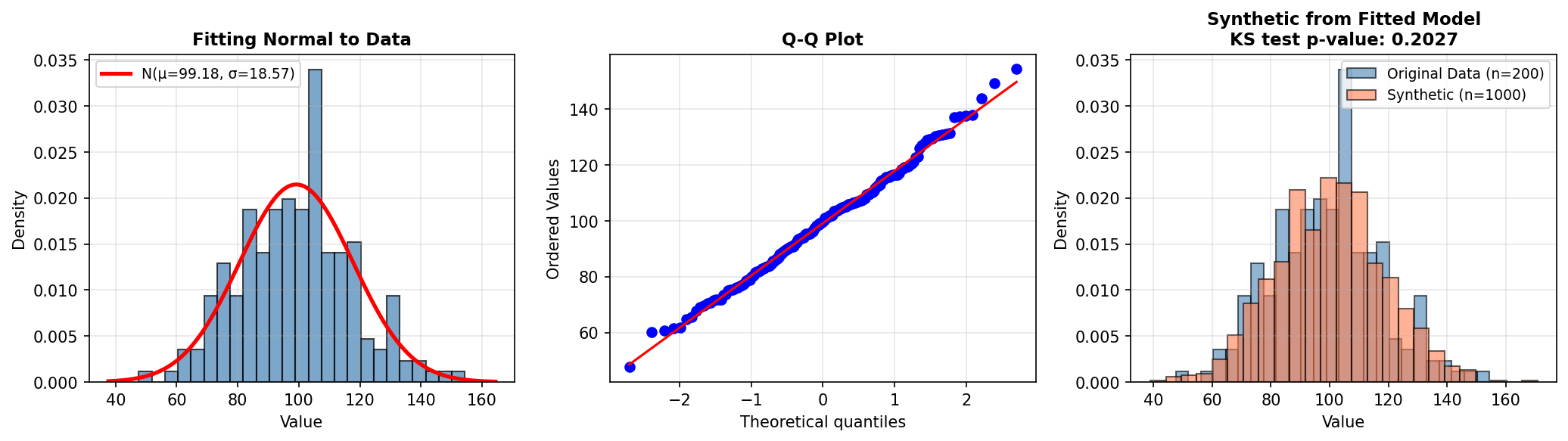
7. Bootstrapping & Resampling
Bootstrap is a non-parametric resampling technique that generates new samples by repeatedly drawing from the existing data with replacement. It requires no distributional assumptions and is extremely flexible.
The bootstrap procedure is simple:
- Take a random sample of size n (with replacement) from the original data of size n
- Compute a statistic (mean, median, standard deviation, etc.) on this resample
- Repeat steps 1–2 B times (e.g., B=1000)
- The distribution of the statistic across resamples estimates its sampling distribution
7.1 Bootstrap for Confidence Intervals and Synthetic Sampling
import numpy as np
import pandas as pd
import matplotlib.pyplot as plt

# Real data: customer purchases (skewed distribution)
np.random.seed(42)
real_purchases = np.concatenate([
    np.random.exponential(scale=50, size=800),
    np.random.exponential(scale=200, size=200)  # High spenders
])

print(f"Real data: n={len(real_purchases)}, mean=${real_purchases.mean():.2f}, median=${np.median(real_purchases):.2f}")

# Bootstrap approach 1: Estimate sampling distribution of the mean
n_bootstrap = 1000
bootstrap_means = []

np.random.seed(42)
for _ in range(n_bootstrap):
    bootstrap_sample = np.random.choice(real_purchases, size=len(real_purchases), replace=True)
    bootstrap_means.append(bootstrap_sample.mean())

bootstrap_means = np.array(bootstrap_means)

# Compute confidence interval
ci_lower = np.percentile(bootstrap_means, 2.5)
ci_upper = np.percentile(bootstrap_means, 97.5)

print(f"\nBootstrap 95% CI for mean: [${ci_lower:.2f}, ${ci_upper:.2f}]")
print(f"Bootstrap mean of means: ${bootstrap_means.mean():.2f}")

# Bootstrap approach 2: Generate synthetic data by resampling
synthetic_bootstrap = np.random.choice(real_purchases, size=5000, replace=True)

# Visualization
fig, axes = plt.subplots(2, 2, figsize=(12, 8))

# Original data
axes[0, 0].hist(real_purchases, bins=50, alpha=0.7, edgecolor='black')
axes[0, 0].set_title('Real Purchase Data')
axes[0, 0].set_xlabel('Purchase Amount ($)')
axes[0, 0].set_ylabel('Frequency')
axes[0, 0].set_xlim(0, 500)

# Bootstrap synthetic
axes[0, 1].hist(synthetic_bootstrap, bins=50, alpha=0.7, edgecolor='black')
axes[0, 1].set_title('Bootstrap Synthetic Samples')
axes[0, 1].set_xlabel('Purchase Amount ($)')
axes[0, 1].set_ylabel('Frequency')
axes[0, 1].set_xlim(0, 500)

# Bootstrap distribution of means
axes[1, 0].hist(bootstrap_means, bins=30, alpha=0.7, edgecolor='black')
axes[1, 0].axvline(ci_lower, color='r', linestyle='--', linewidth=2, label=f'95% CI: [{ci_lower:.0f}, {ci_upper:.0f}]')
axes[1, 0].axvline(ci_upper, color='r', linestyle='--', linewidth=2)
axes[1, 0].axvline(real_purchases.mean(), color='g', linestyle='-', linewidth=2, label=f'Real Mean: {real_purchases.mean():.0f}')
axes[1, 0].set_title('Bootstrap Distribution of Mean')
axes[1, 0].set_xlabel('Sample Mean ($)')
axes[1, 0].set_ylabel('Frequency')
axes[1, 0].legend()

# Q-Q plot: real vs synthetic
axes[1, 1].scatter(np.percentile(real_purchases, np.linspace(1, 99, 50)),
                   np.percentile(synthetic_bootstrap, np.linspace(1, 99, 50)), alpha=0.6)
axes[1, 1].plot([0, real_purchases.max()], [0, real_purchases.max()], 'r--', linewidth=2)
axes[1, 1].set_xlabel('Real Data Quantiles')
axes[1, 1].set_ylabel('Synthetic Data Quantiles')
axes[1, 1].set_title('Quantile-Quantile Plot')

plt.tight_layout()
plt.savefig('bootstrap.png', dpi=150, bbox_inches='tight')
plt.show()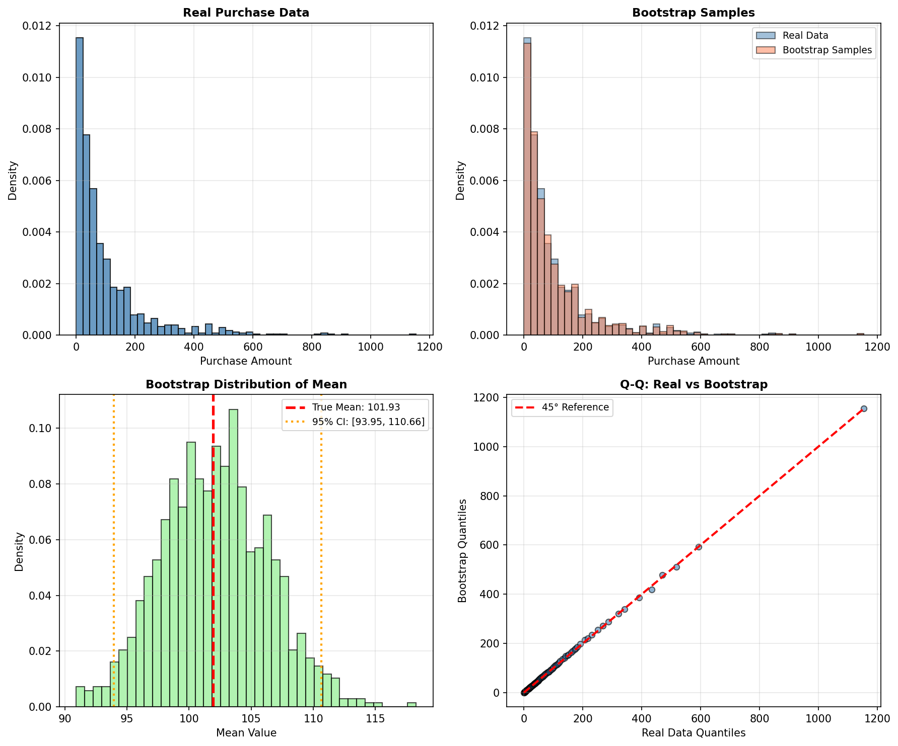
8. Dimensionality Reduction: Understanding Data Structure
High-dimensional data is difficult to visualize, model, and synthesize. Dimensionality reduction techniques project data into lower-dimensional spaces while preserving important structure. These techniques are valuable for exploratory data analysis before generating synthetic data.
8.1 Principal Component Analysis (PCA)
PCA finds orthogonal directions (principal components) that maximize variance in the data. The first component captures the direction of greatest variation, the second captures the next orthogonal direction of greatest variation, and so on. PCA is linear, fast, and interpretable.
8.2 t-SNE (t-Distributed Stochastic Neighbor Embedding)
t-SNE is a nonlinear technique designed for visualization. It preserves local structure—nearby points in high dimensions remain nearby in low dimensions—but does not preserve global distances. Excellent for spotting clusters and outliers, but the coordinates are not easily invertible.
8.3 Example: PCA and t-SNE on Synthetic Customer Data
import numpy as np
import pandas as pd
from sklearn.decomposition import PCA
from sklearn.manifold import TSNE
from sklearn.preprocessing import StandardScaler
import matplotlib.pyplot as plt

# Generate synthetic customer data with clusters
np.random.seed(42)

# Segment 1: Budget-conscious customers
seg1 = np.random.multivariate_normal(
    mean=[30, 2000, 0.8],  # age, annual_spend, loyalty_score
    cov=[[50, 50000, 0.01], [50000, 500000, 50], [0.01, 50, 0.01]],
    size=300
)

# Segment 2: Premium customers
seg2 = np.random.multivariate_normal(
    mean=[45, 15000, 0.95],
    cov=[[80, 200000, 0.005], [200000, 5000000, 200], [0.005, 200, 0.001]],
    size=200
)

# Segment 3: Mid-range customers
seg3 = np.random.multivariate_normal(
    mean=[38, 6000, 0.6],
    cov=[[60, 100000, 0.03], [100000, 1000000, 100], [0.03, 100, 0.05]],
    size=500
)

# Combine and label
data = np.vstack([seg1, seg2, seg3])
labels = np.array([0]*300 + [1]*200 + [2]*500)

# Standardize
scaler = StandardScaler()
data_scaled = scaler.fit_transform(data)

# Apply PCA
pca = PCA(n_components=2)
data_pca = pca.fit_transform(data_scaled)

# Apply t-SNE (slower, but often reveals structure better)
print("Computing t-SNE... (this may take a moment)")
tsne = TSNE(n_components=2, perplexity=30, max_iter=1000, random_state=42)
data_tsne = tsne.fit_transform(data_scaled)

# Visualize
fig, axes = plt.subplots(1, 2, figsize=(14, 5))

colors = ['red', 'blue', 'green']
labels_name = ['Budget', 'Premium', 'Mid-range']

# PCA
for i, (color, label) in enumerate(zip(colors, labels_name)):
    mask = labels == i
    axes[0].scatter(data_pca[mask, 0], data_pca[mask, 1],
                   c=color, label=label, alpha=0.6, s=30)
axes[0].set_xlabel(f'PC1 ({pca.explained_variance_ratio_[0]:.1%} variance)')
axes[0].set_ylabel(f'PC2 ({pca.explained_variance_ratio_[1]:.1%} variance)')
axes[0].set_title('PCA: Preserves Global Structure')
axes[0].legend()
axes[0].grid(True, alpha=0.3)

# t-SNE
for i, (color, label) in enumerate(zip(colors, labels_name)):
    mask = labels == i
    axes[1].scatter(data_tsne[mask, 0], data_tsne[mask, 1],
                   c=color, label=label, alpha=0.6, s=30)
axes[1].set_xlabel('t-SNE Dimension 1')
axes[1].set_ylabel('t-SNE Dimension 2')
axes[1].set_title('t-SNE: Preserves Local Structure')
axes[1].legend()
axes[1].grid(True, alpha=0.3)

plt.tight_layout()
plt.savefig('dimensionality_reduction.png', dpi=150, bbox_inches='tight')
plt.show()

print(f"\nPCA Explained Variance Ratio: {pca.explained_variance_ratio_}")
print(f"Cumulative variance explained by first 2 PCs: {pca.explained_variance_ratio_.sum():.1%}")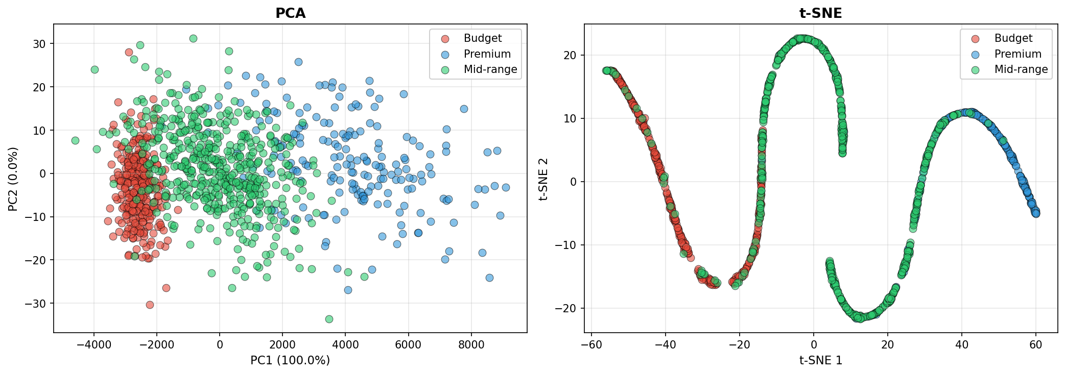
9. Putting It Together: A Complete Statistical Pipeline
This section demonstrates a practical end-to-end workflow: load real data, analyze its structure, fit distributions, model correlations, and generate synthetic records.
import numpy as np
import pandas as pd
from scipy import stats
from sklearn.preprocessing import StandardScaler
import matplotlib.pyplot as plt

# STEP 1: Load or simulate real data
print("=" * 60)
print("STEP 1: Load Real Data")
print("=" * 60)

np.random.seed(42)

# Simulate a realistic customer dataset
n_real = 500
real_data = {
    'age': np.random.normal(40, 15, n_real),
    'income': np.random.lognormal(10.5, 0.5, n_real),
    'tenure_months': np.random.exponential(scale=24, size=n_real),
    'is_premium': np.random.binomial(1, 0.3, n_real),
}

df_real = pd.DataFrame(real_data)
df_real['age'] = df_real['age'].clip(18, 85)  # Realistic bounds

print(f"Loaded {len(df_real)} real records")
print(df_real.describe())

# STEP 2: Analyze marginal distributions
print("\n" + "=" * 60)
print("STEP 2: Analyze Marginal Distributions")
print("=" * 60)

# Test normality with Shapiro-Wilk test
for col in ['age', 'income', 'tenure_months']:
    stat, p_value = stats.shapiro(df_real[col])
    print(f"{col}: Shapiro-Wilk p-value = {p_value:.4f}")

# Treat the p-value as a screening signal, not a final verdict.
# With large samples, tiny harmless deviations can reject normality; with small
# samples, meaningful non-normality may go undetected. Always inspect plots too.

# STEP 3: Fit distributions and estimate parameters
print("\n" + "=" * 60)
print("STEP 3: Fit Distributions to Marginals")
print("=" * 60)

fitted_dists = {}

# Age: Normal
mu_age, sigma_age = stats.norm.fit(df_real['age'])
fitted_dists['age'] = ('norm', {'loc': mu_age, 'scale': sigma_age})
print(f"Age ~ Normal(μ={mu_age:.1f}, σ={sigma_age:.1f})")

# Income: Lognormal (skewed). Fix location at 0 — income is non-negative.
shape, loc, scale = stats.lognorm.fit(df_real['income'], floc=0)
fitted_dists['income'] = ('lognorm', {'s': shape, 'loc': loc, 'scale': scale})
print(f"Income ~ Lognormal(shape={shape:.2f}, scale={scale:.0f})")

# Tenure: Exponential
scale_tenure = stats.expon.fit(df_real['tenure_months'])[1]
fitted_dists['tenure_months'] = ('expon', {'scale': scale_tenure})
print(f"Tenure ~ Exponential(scale={scale_tenure:.1f})")

# Premium flag: Bernoulli
p_premium = df_real['is_premium'].mean()
fitted_dists['is_premium'] = ('binom', {'n': 1, 'p': p_premium})
print(f"Premium ~ Bernoulli(p={p_premium:.2f})")

# STEP 4: Estimate correlation structure
print("\n" + "=" * 60)
print("STEP 4: Estimate Correlation Structure")
print("=" * 60)

corr_matrix = df_real[['age', 'income', 'tenure_months']].corr()
print("Correlation Matrix:")
print(corr_matrix)

# STEP 5: Generate synthetic data using Gaussian copula
print("\n" + "=" * 60)
print("STEP 5: Generate Synthetic Data (Gaussian Copula)")
print("=" * 60)

# Step 5a: Sample from copula
n_synthetic = 5000
mvn = stats.multivariate_normal(
    mean=np.zeros(3),
    cov=corr_matrix.values
)
copula_samples = stats.norm.cdf(mvn.rvs(size=n_synthetic, random_state=42))

# Step 5b: Transform to marginals via inverse-CDF of each fitted distribution.
# is_premium is treated as independent here (we did not include it in the copula
# above). Sampling it from a fresh uniform keeps its marginal rate at p_premium
# while avoiding a spurious coupling to age.
rng_is_premium = np.random.default_rng(seed=42)
synthetic_data = {
    'age': stats.norm.ppf(copula_samples[:, 0], loc=mu_age, scale=sigma_age),
    'income': stats.lognorm.ppf(copula_samples[:, 1], s=shape, loc=loc, scale=scale),
    'tenure_months': stats.expon.ppf(copula_samples[:, 2], scale=scale_tenure),
    'is_premium': (rng_is_premium.random(n_synthetic) < p_premium).astype(int),
}

df_synthetic = pd.DataFrame(synthetic_data)
df_synthetic['age'] = df_synthetic['age'].clip(18, 85)

print(f"Generated {len(df_synthetic)} synthetic records")
print(df_synthetic.describe())

# STEP 6: Compare real vs. synthetic
print("\n" + "=" * 60)
print("STEP 6: Validation")
print("=" * 60)

print("\nCORRELATION COMPARISON:")
print("Real correlation matrix:")
print(df_real[['age', 'income', 'tenure_months']].corr())
print("\nSynthetic correlation matrix:")
print(df_synthetic[['age', 'income', 'tenure_months']].corr())

# Visualization
fig, axes = plt.subplots(2, 4, figsize=(16, 8))

# Row 1: Marginal distributions
axes[0, 0].hist(df_real['age'], bins=30, alpha=0.6, label='Real', edgecolor='black')
axes[0, 0].hist(df_synthetic['age'], bins=30, alpha=0.6, label='Synthetic', edgecolor='black')
axes[0, 0].set_title('Age')
axes[0, 0].legend()

axes[0, 1].hist(np.log1p(df_real['income']), bins=30, alpha=0.6, label='Real', edgecolor='black')
axes[0, 1].hist(np.log1p(df_synthetic['income']), bins=30, alpha=0.6, label='Synthetic', edgecolor='black')
axes[0, 1].set_title('Income (log scale)')
axes[0, 1].legend()

axes[0, 2].hist(df_real['tenure_months'], bins=30, alpha=0.6, label='Real', edgecolor='black')
axes[0, 2].hist(df_synthetic['tenure_months'], bins=30, alpha=0.6, label='Synthetic', edgecolor='black')
axes[0, 2].set_title('Tenure (months)')
axes[0, 2].legend()

df_real['is_premium'].value_counts().plot(kind='bar', ax=axes[0, 3], alpha=0.6, label='Real')
df_synthetic['is_premium'].value_counts().plot(kind='bar', ax=axes[0, 3], alpha=0.6, label='Synthetic')
axes[0, 3].set_title('Premium Flag')
axes[0, 3].legend()

# Row 2: Scatter plots of key relationships
axes[1, 0].scatter(df_real['age'], np.log1p(df_real['income']), alpha=0.3, s=10, label='Real')
axes[1, 0].scatter(df_synthetic['age'], np.log1p(df_synthetic['income']), alpha=0.3, s=10, label='Synthetic')
axes[1, 0].set_xlabel('Age')
axes[1, 0].set_ylabel('log(Income)')
axes[1, 0].set_title('Age vs Income')
axes[1, 0].legend()

axes[1, 1].scatter(df_real['age'], df_real['tenure_months'], alpha=0.3, s=10, label='Real')
axes[1, 1].scatter(df_synthetic['age'], df_synthetic['tenure_months'], alpha=0.3, s=10, label='Synthetic')
axes[1, 1].set_xlabel('Age')
axes[1, 1].set_ylabel('Tenure')
axes[1, 1].set_title('Age vs Tenure')
axes[1, 1].legend()

axes[1, 2].scatter(np.log1p(df_real['income']), df_real['tenure_months'], alpha=0.3, s=10, label='Real')
axes[1, 2].scatter(np.log1p(df_synthetic['income']), df_synthetic['tenure_months'], alpha=0.3, s=10, label='Synthetic')
axes[1, 2].set_xlabel('log(Income)')
axes[1, 2].set_ylabel('Tenure')
axes[1, 2].set_title('Income vs Tenure')
axes[1, 2].legend()

axes[1, 3].axis('off')

plt.suptitle('Real vs. Synthetic Data Comparison', fontsize=14, fontweight='bold')
plt.tight_layout()
plt.savefig('pipeline_comparison.png', dpi=150, bbox_inches='tight')
plt.show()

print("\nSynthetic data generated and validated successfully!")
print("Next step: Use synthetic data for model training, testing, or augmentation.")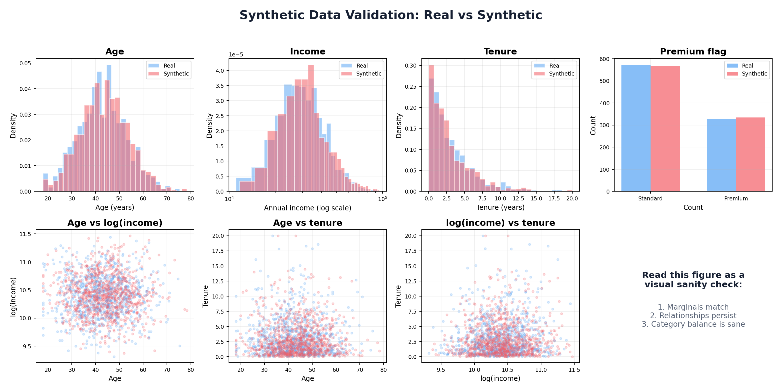
Conclusion
Statistical foundations are essential to synthetic data generation. By understanding probability distributions, correlations, and estimation techniques, you can build principled synthetic data pipelines that preserve the essential properties of real data.
The techniques in this chapter—parametric distributions, Gaussian copulas, kernel density estimation, and maximum likelihood estimation—form the toolkit for Chapters 3 and beyond. Some practitioners will use these methods directly; others will combine them with machine learning and deep learning approaches to handle more complex, high-dimensional data.
Key takeaways:
- Always analyze your data's marginal distributions before generation
- Correlations matter: use copulas or other dependence models
- Validate synthetic data against real data on both univariate and multivariate statistics
- Trade off complexity and interpretability: simpler models are easier to debug
- No one-size-fits-all solution: the best approach depends on your data, use case, and constraints
In Chapter 3, we will apply these statistical foundations to rule-based and simulation-based synthetic data generation, showing how to encode domain knowledge and business logic directly into the generation process.
References and Further Reading
- (2002). Statistical Inference. Duxbury, 2nd Edition.
- (2006). An Introduction to Copulas. Springer, 2nd Edition.
- (1959). Fonctions de repartition a n dimensions et leurs marges. Publications de l'Institut de Statistique de l'Universite de Paris, 8, 229-231.
- (1986). Density Estimation for Statistics and Data Analysis. Chapman and Hall.
- (2015). Multivariate Density Estimation: Theory, Practice, and Visualization. Wiley, 2nd Edition.
- (1979). Bootstrap Methods: Another Look at the Jackknife. Annals of Statistics, 7(1), 1-26. projecteuclid.org/journals/annals-of-statistics/volume-7/issue-1
- (1951). The Kolmogorov-Smirnov Test for Goodness of Fit. Journal of the American Statistical Association, 46(253), 68-78.